So you’ve concocted the best array of food and sauces but nobody is trying them. Your burgers are the best in town but they’re not selling. And let’s not even get started on how fantastic your steaks are. Yet, your tables are empty and you’re paying your servers to twiddle their thumbs. Why? Chances are you neglected your menu design.
It seems quite often that very little time or energy is put into menu design. After people smell and try your food, why would the design of the menu matter, it’s the food people want. But the menu is often the first impression. People want to see what sort of variety you offer, how expensive the options are, and above all, is there Happy Hour? In the land of the now and home of the impatient, the menu needs to be engaging, informative, and easy to read.
Your menu is an advertisement that all of your customers are guaranteed to pay attention to. Follow these tips to ensure your menu design is as effective as possible.

#1- Menu Design is King
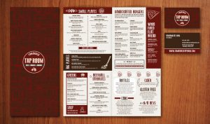
Space on a menu is as valuable as real estate, so utilize the your limited area to its fullest. Specials are usually highlighted in separate, block areas that draw the customer’s attention. Some restaurants use this to influence decisions on the entire menu based on price or perceived value. The menu design should reflect the style and atmosphere of the restaurant. Elegant font and white space usually work well for upscale places, where bold colors and graphics may appeal to more casual or unique concept restaurants. Graphics can be used to draw the customer’s attention to a specific menu item or special. The key here is not to be overtly distracting from the flow of the menu, but just enough to highlight the desired item or selection.
#2- Use Descriptive Words
The menu design is important, but so are the descriptions of the food. They need to be clear, concise, and appetizing. Give each item its own unique description. There’s a reason you chose to serve every item on the menu, so let your customers know why.
Make sure your meals sound like well thought out meals, not just food thrown on a plate. Each item in a meal should sound like it accompanies each other and not like the chef is trying to clear out the kitchen.
Don’t be afraid to use adjectives and embellishments when describing your meals. A Cornell University study found that descriptive text can increase sales by 27%. Simple things like using regional and brand names appeal to consumers. A “Southern fried chicken with Kentucky Bourbon glaze” will sell more than “Fried chicken with house sauce”.
 #3- Mobile Friendly
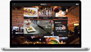
One thing we see a lot on websites but wish we didn’t are PDF menus. Most people won’t take the time to download a PDF, and even if the previously interested potential customer’s phone can open it, zooming in and scrolling sideways is not a good first impression. Ditch the PDF menu. Make it live, incorporate it into your website design, and make life easier on your potential guests and yourself.
#4- Invest in Photography
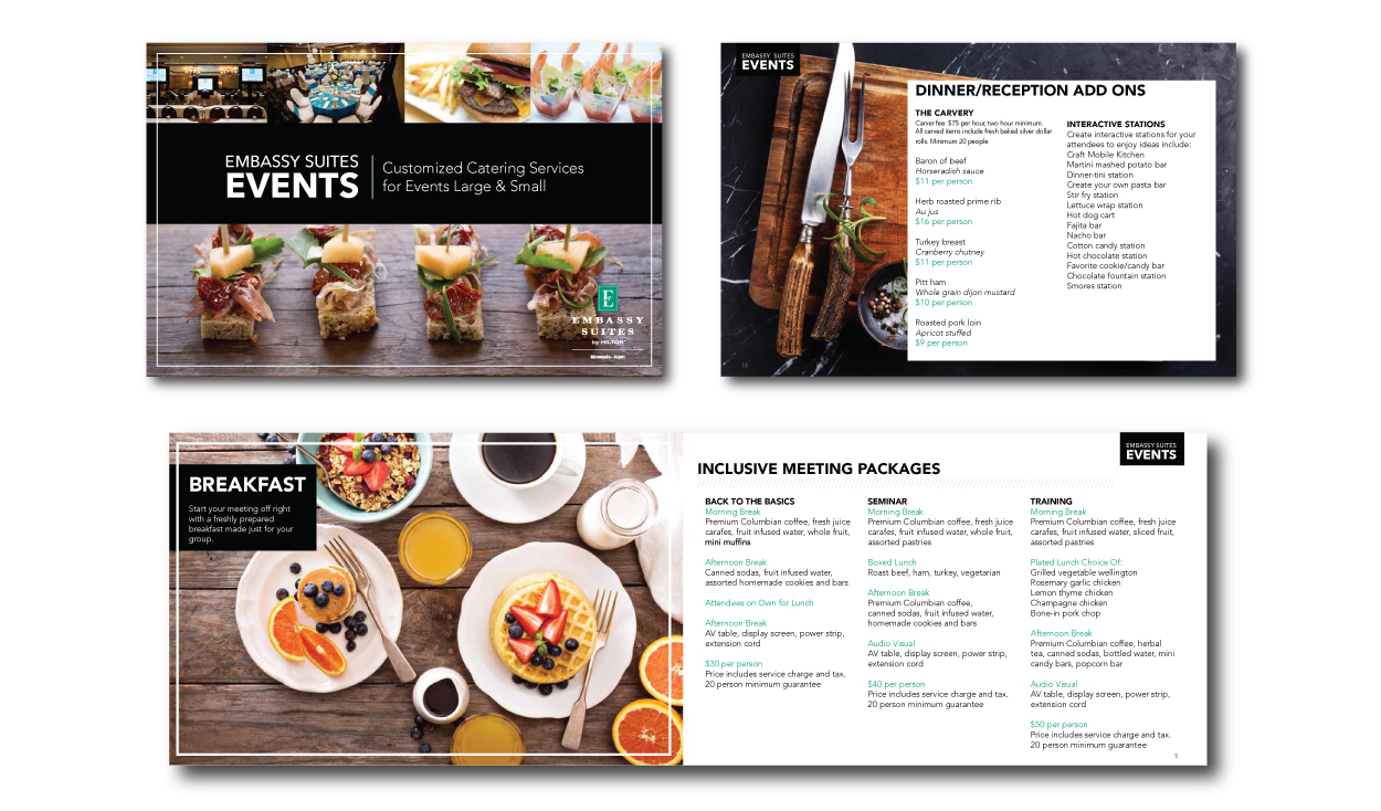
People like to see what they are going to get, but make sure you are using quality images. Many smaller restaurants, especially Chinese take-out, use low grade photos that are often unappealing and unrepresentative of what the dish actually is. Spend the money, take the time, and use stunning images in your menu design to show the world the food you have to offer.
To see recent examples of successful menu designs, check out some of our previous work here.


Recent Comments