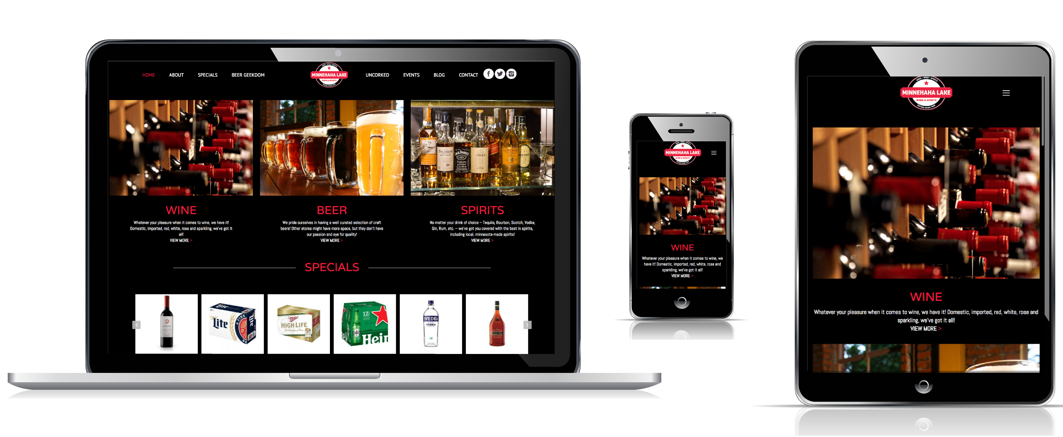
Minnehaha Lake Wine & Spirits came to us in need of a rebrand and custom website redesign. They didn’t have a “real” logo just their store sign and their website had been created in Wix and the design was outdated and hard to update. They wanted to create a bold, modern brand, that would stand out from their competition. Their store had been in business since 1939 and it was important for them to keep the historical aspect in their design.The owners grandfather immigrated to Minnesota after surviving the concentration camps in WWII, and purchased the liquor store. It was vital that the history remain part of the brand. Their store signs were iconic and they wanted to make sure the new logo would still be recognizable as part of their historic brand.
 We began by looking over their long history, studying their competition and working with their iconic signage to create a logo design that would be modern yet pay homage to their history. The new logo uses the same color scheme as the store signs and awning paired with a more modern font. The circular shape and style of the logo looks similar to a beer bottle, which is appropriate given their wide selection of craft beer. We kept the logo simple and clean to create an iconic and memorable design.
For the website we focused on featuring their specials and diving them into easy to view categories; beer, wine, spirits. The site has a very clean modern look, and is easy to navigate. The history of the store is told on the About page which shows photos of the original store. We’ve also included an event calendar and a beer and wine signup to keep customers engaged with the store. The client was very happy with the new site design and the ease of making updated through WordPress. Check out the custom website redesign at: minnehahalakews.com


Recent Comments