The Project Goals
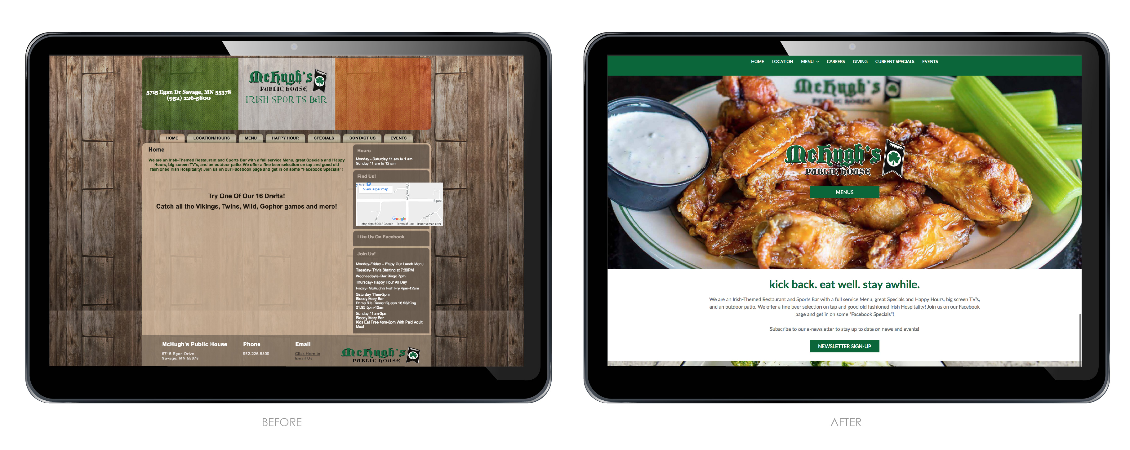
McHughs Public House asked us for a website redesign for their restaurant. They wanted to update their website to a responsive modern style design. Their old website was hard to navigate, and didn’t have much food images or restaurant info. Their menus were also in PDF format and hard to read. Their main objectives for the website redesign were to create a mobile friendly website, an overall updated look, adding more pages like, career and event pages. Overall they wanted a clean look. They were in the process of a remodel, with all new dark brown wood tables, they really liked the dark wood look with crisp white and pops of green.
About the Client
McHughs is an Irish sports bar and they wanted to have that feel through out the site. McHughs Public House is local restaurant imbedded in an upscale neighborhood of Savage. They are the only local bar owned in the area, and they wanted the new site to be different from their chain restaurant competitors. They are a family friendly local restaurant that is involved in our community. To showcase this we added a Giving page.
Beginning the Redesign
We began the website redesign by creating a very clean modern design. The homepage has beautiful food photos, breaks up their menu into six easy to access links with live menus, and shows their upcoming events. Additionally we added an e-newsletter sign-up so they can keep in touch with their customers. The navigation is very simple with a location, menus, careers, giving, current specials and events page. This makes it very easy for their customers to access what they are looking for. The inside pages are also very clean and simple. With one image and short description text. We also added their social media links and event calendar.
We designed and developed the website in WordPress which makes it very easy for the client to update. The client was very happy with the new site and said it looks Awesome! Check out the new website at mchughspublichouse.com and let us know what you think.


Recent Comments