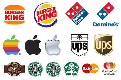
A company’s move to undergo a logo redesign and brand identity refresh carries heavier motive than simply transforming a faded icon on a website into a more elegant and modern design. Sure, the way your logo appears is important; however, what prompts a company to reconsider its current image is a multifaceted matter, one that will be discussed in this article.
Rebranding vs. Logo Refresh and Full Logo Redesign
Simply put, a brand refresh is a means to visually update your company. Both a logo refresh and full logo redesign fit into the idea of a brand refresh. However, there is a difference between simply tweaking your logo, and a full-blown renovation. The former may occur in the event that a small change appears in your company’s mission or vision, which requires a slight change in your public image. On the other hand, a full logo overhaul can occur if your current logo is way out of date, if a company merger is at play, or if your current logo no longer represents your message in any way, shape, or form.

1. Your Logo Is Outdated
This is probably the most obvious reason for a logo redesign. Let’s take Microsoft as an example. The tech giant’s logo used to be a generic black typeface with no flare to it–unless you consider italics to be fancy. With Apple gaining on them, Microsoft decided that sprucing up its archaic logo might just be the perfect ticket to rekindled profits. Clearly, the more elegant, modern design introduced in 2012 has sat better with the public, and has only done good for the company.

2. You Need to Refuel Publicity
Sometimes, the quality of your company’s product just isn’t enough to fuel publicity. Therefore, in order to boost publicity, companies opt for a logo redesign and brand refresh to more effectively sell their products and maximize revenue. For instance, we’ve all heard of Angie’s Boomchikapop, but not because of how delicious the popcorn is. Rather, the company’s success derives from its logo and brand refresh–yes, the bag itself is the source of Angie’s Boomchikapop’s publicity boon.

3. Company Merger
Let’s say you find yourself in the midst of a company merger, and the company with which you are colliding has a wildly different logo than you. Naturally, you wouldn’t just want to mash the two designs together and call it a day. If you do that, you’ll probably end up with something that your target audience will find both sloppy and unappealing.
When a company merger unravels, both parties need to re-evaluate their mission and vision so that they can coexist and work in tandem as partners. Often, this re-evaluation should lead to a logo redesign and brand identity refresh. Why? This way both companies can display their unity, and more accurately portray their message. A great example of a company merger and logo refresh that comes to mind is ExxonMobil.

4. Standing Out in A Competitive Market
An oligopoly is when multiple firms hold control over a single product or service in a given market. Let’s think about delivery services for a second, of which there are many. How does FedEx, for example, stand out from its competition? Like many companies involved in oligopolies, FedEx integrates subliminal messaging in its logo to appeal to its target audience. If you look carefully at the FedEx logo, you will notice an arrow between the E and X. According to Business Insider, “Even a glance subliminally inspires thoughts of efficiency and forward motion.” Now that’s definitely something to consider if your company is currently in the midst of a competitive market doozy.
5. Accurately Reflecting Your Mission and Values
As time passes, your company’s values may change. Therefore, it is important that both your brand identity and logo adapt accordingly. Why? Because if your company image no longer encapsulates your mission and vision, this may breed confusion over your message, negative publicity, and you may risk lose customers as a result. Let’s take YouTube as an example. If you had never seen or heard of YouTube before, and you glanced at the old logo, you wouldn’t be able to tell that the company is a platform for videos. Now, that’s quite a concern because the whole point of YouTube is videos, and if people don’t understand that, it won’t be good for business. Therefore, in order to better reflect its mission and values, YouTube decided to refresh its logo (adding a video icon), and made its message crystal clear.
Crafting effective logo redesigns and helping companies undergo incredible brand transformations is our passion. We love seeing the process of something old and outdated become something new and exciting, and we have worked on dozens of logo and brand refresh projects. Check out our latest brand identity and logo design work


Recent Comments