Companies change their names for many reasons. Sometimes they are seemingly simple changes made to reflect an evolving business, like Apple Computers changing to Apple. Some changes are made to separate companies from bad press, like Blackwater tried to do by changing their name to Xe Services after human rights accusations. They have since changed their name again to Acedemi. Read More
Logo concepts evolve as our technology and personal outlooks do. Sometimes technology is the driving force, other times it is our personal values. Drawing on both sources for inspiration is a good idea to create a more secure and lasting logo/identity. Read More
Trends come and go so fast you probably learn about many of them after they’ve gone away. Capitalizing on current trends can be fruitful, but you need to keep your content current for maximum impact. Read More
The Perfect Place came to us in a need of reinventing their branding and website design. The Perfect Place is the wedding division of the Embassy Suites Airport. They wanted a fresh new look that would stand out from the competition and appeal to all brides. We began by renaming the devision The Perfect Wedding in order to clearly identity their service offering, which is weddings. The original logo used a very generic script font, so we redesigned the logo to a more unique design utilizing a custom script font, a beautiful flower icon and a soft brown and teal color scheme. We also created a set of three unique icons for their main service; catering, wedding packages and accommodations which are used throughout their brand identity collateral as well as the website. Read More
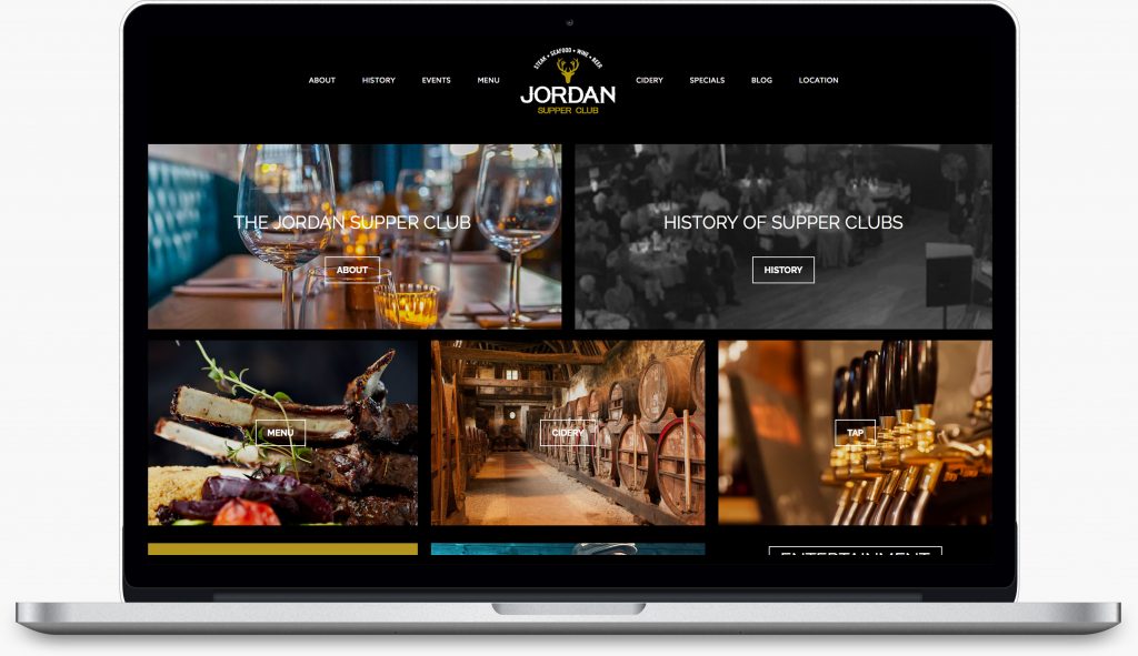
When the team behind Tamarack Taproom approached us with restaurant concept focused on beer, burgers and bourbon, all in comfortable, laid-back setting, we knew we wanted to be a part of the project. We set to work creating a brand identity system that is modern and memorable, and unique custom website design. The logo uses a modern eroded style font to match the fun concept and atmosphere of the restaurant. The hops icon further reinforces the focus on craft beer. The dark burgundy, beige, white and dark brown color scheme appeals to a wide audience. Read More

Recent Comments